Introduction
In this step-by-step walkthrough I’ll be showing you how to use Expression Blend 3 to create a template for shiny round buttons somewhat like the play button in Windows Media Player or the back and forward buttons in Internet Explorer.
The tutorial is split over three posts:
Part 1 Creating the static template (WPF and Silverlight)
Part 2 Adding transitions using triggers (WPF only)
Part 3 Adding transitions with the Visual State Manager (Silverlight and WPF)
The resulting template can be applied to standard WPF or Silverlight Button controls and styled with different colours to create buttons like these:
Part 1 Creating the static template (WPF and Silverlight)
In this part we’ll create a static version of the button template which will be the same for both WPF and Silverlight.
Create the project
Start Blend, and select ‘New Project…’.
On the New Project dialog select either ‘Silverlight 3 Application’ or ‘WPF Application’. Give the project a name and click the OK button to create the project.
Add a button
Blend will now present you with a XAML file showing a blank white rectangle.
| Double click the button tool : |
This will insert a button in the top-left of the layout.
Set the button properties
With the new button selected, use the properties panel to set the following properties:
Set the Height and Width to 40.
Set the Content to 4 (Yes, just the number 4).
Set the font family to Webdings. This turns the number 4 into a ‘play’ triangle.
Set the font size to 22 pt.

Click in the ‘Hex value’ box and type ‘DarkBlue’. Press enter and this should change into the hex value.
Similarly, set the ‘BorderBrush’ property to ‘Cyan’ and the Foreground brush to ‘White’, making sure to select the ‘Solid color brush’ editor each time.
Your button should now look something like this for WPF:
or this for Silverlight:
The difference at this stage is down to the default button templates used by Silverlight and WPF.
Create the Template
Right click the button and select ‘Edit Template/Create Empty…’.
This brings up the ‘Create ControlTemplate Resource’ dialog.
Name the new template ShinyRoundButtonTemplate and click OK to close the dialog.
Add the background
The ‘Objects and Timeline’ panel switches to show the content of the template being edited – so far that consists of nothing but a Grid.
Set the Name property of the Grid to ‘main_grid’.
We’re going to add an ellipse, so if the ellipse tool isn’t displayed on the toolbar, click and hold the Rectangle or Line tool to display and select Ellipse:
Now double click the Ellipse tool to insert an ellipse that will occupy the whole of the template’s ‘main_grid’.
Set the Name of the ellipse to ‘background’.
Click the ‘Advance property options’ button adjacent to the ellipse’s Fill brush.
On the popup menu, select ‘Template Binding/Background’.
Click the ‘Advance property options’ button adjacent to the ellipse’s Stroke brush. Select ‘Reset’ to set the Stroke property to ‘No brush’.
Add the Outer Glow
Double-click the ellipse tool again to add another ellipse.
Give this ellipse the name ‘outer_glow’.
Use the advance options again to set the Fill brush to ‘Template Binding/BorderBrush’ and set the Stroke property to ‘No brush’.
This ellipse will be used to provide an outer glow for the button.
Under the Appearance section of the Properties panel, locate the Effect property and click the New button. This brings up the Select Object dialog. Select BlurEffect and close the dialog by clicking OK.
Set the Radius of the BlurEffect to 10.
The ‘outer_glow’ ellipse should be behind the background, so that only the blur around the edge is visible. Right click on the ellipse and select ‘Order/Send to Back’.
The outer glow will only be displayed when the mouse is over the button, for the default button state, we want to hide this ellipse.
Set the Opacity property of the ‘outer_glow’ ellipse to 0%.
Add Lightener and Darkener
When the state of the button changes, the template will lighten or darken the background colour. We’ll achieve this by overlaying a couple of partially opaque ellipses. In the button’s default state, these will both be hidden.
Double-click the ellipse tool again to add another ellipse.
Give this ellipse the name ‘lightener’.
Set its Fill brush to White, reset its Stroke brush, and set its Opacity to 0%.
In the same way, add another ellipse named ‘darkener’.
Set its Fill brush to Black, reset its Stroke brush, and set its Opacity to 0%.
Add the Inner Glow
Double-click the ellipse tool again to add another ellipse. Name this one ‘inner_glow’.
Set the ellipse’s Margin to 1,1,1,1.
Use the advance options to set the Fill brush to ‘Template Binding/BorderBrush’ and reset the Stroke brush.
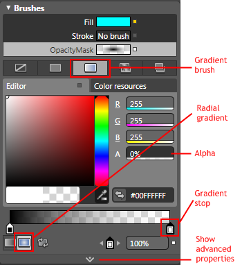
In the Brushes category, select ‘OpacityMask’.
Select ‘Gradient Brush’ and then ‘Radial Gradient’.
Select the right hand gradient stop and set its alpha value to 0%
Click the ‘Show advance properties’ expander below the brush editor.
Set the following properties for the brush:
GradientOrigin = 0.5, 1
Center = 0.5, 1
RadiusX = 0.8
At this point, the button should look like this:
Add the highlights
Double-click the ellipse tool again to add another ellipse.
Give this ellipse the name ‘lower_highlight’.
Reset the ellipse’s Fill brush to ‘No brush’.
Use the advance options again to set the Stroke brush to ‘Template Binding/BorderBrush’.
Select ‘OpacityMask’ and then select ‘Gradient Brush’.
Drag the left hand gradient stop to around the 55% position and set its alpha value to 0%.
In the Layout category, set the ellipse’s Margin to 1,1,1,1.
Double-click the ellipse tool again to add another ellipse.
Give this ellipse the name ‘upper_highlight’.
Reset the ellipse’s Fill brush to ‘No brush’.
Select the ‘Stroke’ brush and then select ‘Gradient Brush’.
Set the left hand gradient stop to ‘White’.
Drag the right hand gradient stop to around the 45% position and set it to ‘#00000000’ in the Hex value box.
Set the ellipse’s Margin to 1,1,1,1.
The button should now look like this:
Add the shine
Double-click the Grid tool to add a new grid. Name this grid ‘shine_grid’.
Set the new grid’s left and right Margin to 2, and top and bottom Margin to 1.
With ‘shine_grid’ selected, expand the advanced properties of the Layout section.
Click the button marked ‘…’ next to the RowDefinitions property. This brings up the ‘RowDefinition Collection Editor’ dialog. Click the ‘Add another item’ button twice to add two rows to the grid. Close the dialog by clicking the OK button.
With ‘shine_grid’ still selected, double click the ellipse tool to add an ellipse as a child of ‘shine_grid’.
Right click the new ellipse and select ‘Path/Convert to Path’. Name the new path ‘shine’.
This part is a bit fiddly, so it may be helpful to increase the zoom on the artboard. Try about 400%.
| Click the ‘Direct Selection’ tool: |
Four points on the path are now displayed. Click the bottom point to select it.
Use the up arrow key to nudge this point up until it is in line with the left and right points.
The result should look like this:
The Nudge operation will adjust the Margin property, so use the ‘Advance property options’ to reset the path’s Margin.
Set the Stroke property to ‘No Brush’.
Select the Fill brush, select ‘Gradient brush’ and ‘Radial gradient’.
Select the left hand gradient stop and set its hex value to #27FFFFFF.
Add a new gradient stop at around the 42% position and set its hex value to #2DFFFFFF.
Select the right hand gradient stop and set its hex value to #7CFFFFFF.
Click the ‘Show advanced property’ expander below the brush editor.
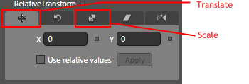
On the Translate tab of the brush’s RelativeTransform, set the Y value to 0.5.
On the Scale tab, set the Y value to 2.
The button should now look like this:
Add the ContentPresenter
Finally, we want the button to display its content, so we need a ContentPresenter.
Select ‘main_grid’. We want the ContentPresenter to be added as a child of this grid.
On the Assets panel, select Controls and double-click on ContentPresenter.
You should now see the triangle we originally added as our button’s content, but its not centred in the button.
Find the Layout category in the Properties panel.
For the HorizontalAlignment property, click the ‘Advanced property options’ and select ‘TemplateBinding/HorizontalContentAlignment’.
In the same way, bind the VerticalAlignment property to ‘TemplateBinding/VerticalContentAlignment’.
Your button should now look like this:
Wrapping up
That’s it for the static parts of the template.
In future posts, I’ll walkthrough adding states and transitions to bring the button to life.


No comments:
Post a Comment