Introduction
This is the second of three posts showing how to use Expression Blend 3 to create a shiny button template for WPF and Silverlight.
Part 1 Creating the static template (WPF and Silverlight)
Part 2 Adding transitions using triggers (WPF only)
Part 3 Adding transitions with the Visual State Manager (Silverlight and WPF)
In part 1 we created a static template that was applied to the button shown below:
In this part we’ll be creating different appearances for various button states, and animating some of the transitions between states.
If you haven’t worked through part 1, you can download the WPF version of the static template here and use it as the starting point for what follows.
You can download the finished project for part two, or just the XAML file containing the finished template.
Part 2 Adding transitions using triggers (WPF only)
Controls like Button change their visual appearance to indicate different states. In this post, we’ll give our button template different looks when the button is disabled, when it is pressed and when the mouse is over the button.
Triggers versus The Visual State Manager
The traditional way to implement control states and transitions in WPF 3.0/3.5 is to use triggers.
For Silverlight, Microsoft created the Visual State Manager (VSM)with the goal of making it easier to build interactive control templates.
The Visual State Manager will be included in WPF 4 and is currently available for WPF 3.5 through the WPF Toolkit. You can use Expression Blend 3 to add VSM states and transitions to a WPF project and Blend will automatically update your project to include a reference to WPFToolkit.dll.
In this post I’ll cover using triggers to change the buttons appearance for different states.
In part 3, I’ll show how to create the same effects using states and transitions with the Visual State Manager.
About Triggers
Like other WPF controls, Button indicates its states and transitions with properties (such as IsEnabled and IsPressed) and events (such as MouseEnter and MouseLeave).
In this post, we’ll be using two types of triggers:
A regular Trigger is activated by a specific property value and contains Setters that instantly apply values to other properties.
An EventTrigger is activated by a RoutedEvent and has a collection of actions (such as starting an animation) that are performed when the trigger is activated.
It’s something of an aesthetic choice whether to animate a particular transition. Instant changes create a more responsive feeling and seem appropriate for indicating that a button has been clicked. Animated transitions can be smoother, and create more subtle effects.
Get Started
Fire up Blend and open the project from part one.
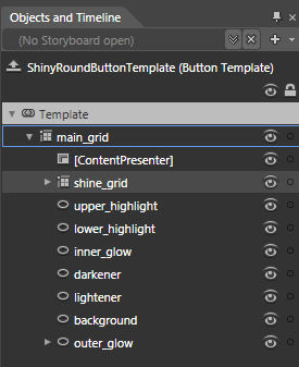
Right-click on the button, and select ‘Edit Template/Edit Current’. The ‘Objects and Timeline’ panel switches to show the content of the template.
Add the Disabled state
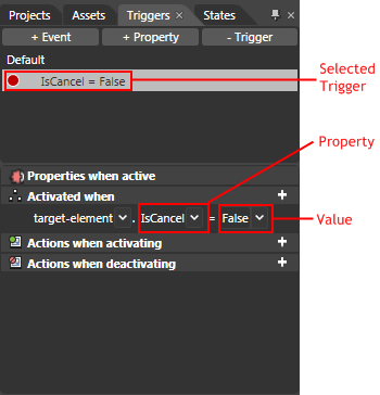
Select the Triggers panel and click the ‘+Property’ button to add a property trigger.
The Trigger is initially created to be activated by the IsCancel property. Use the drop down box to change the property from IsCancel to IsEnabled.
The artboard is now surrounded by a red border to show that it is in recording mode.
In this mode, any properties we change will be recorded in the Trigger’s Setters collection, to be applied when the Trigger is activated.
Use the ‘Objects and Timeline’ panel to select the grid named ‘main_grid’. On the Properties panel set the grid’s Opacity to 50%.
Select the ellipse named ‘inner_glow’ and set its Visibility property to Hidden. Do the same for the ellipse named ‘upper_highlight’.
Select the ellipse named ‘lower_highlight’. Under the Brushes category of the Properties panel, select the Stroke brush.
The yellow box around the brush editor indicates that this property is bound with a TemplateBinding. Click the ‘Advanced property options’ button next to the Stroke brush and select ‘Convert to Local Value’. The ‘solid color brush’ editor should now be selected. In the ‘Hex value’ box enter ‘White’ and hit return.
Select the ellipse named ‘background’. Click the ‘Advanced property options’ button next to the Fill brush. Select ‘Convert to Local Value’. In the ‘Hex value’ box enter ‘#7F000000’ and hit return.
Select the Stroke brush and the ‘Solid color brush’ editor. Set the colour to black.
Your disabled button should now look like this:
Add the Pressed state
On the Triggers panel and click the ‘+Property’ button to add another property trigger.
Use the drop-down box below the ‘Activated when’ heading to change the Trigger’s property to ‘IsPressed’.
Click the value drop-down box, type ‘True’ and press enter.
Select the ellipse named ‘darkener’ and set its Opacity to 50%.
Select the ellipse named ‘lower_highlight’ and set its Visibility to Hidden.
Select the grid named ‘shine_grid’ and set its Opacity to 70%.
Select the ellipse named ‘upper_highlight’ and set its Opacity to 60%.
Select the ellipse named ‘inner_glow’ and select its OpacityMask brush. Click the ‘Show advanced properties’ expander below the brush editor.
Set the brush’s RadiusX property to 0.5 and its Opacity to 80%.
Your pressed button should now look like this:
Add the MouseEnter animation
On the Triggers panel and click the ‘+Event’ button to add an EventTrigger.
The EventTrigger is created for the Loaded event. Select the new trigger and use the drop-down box to select the MouseEnter event instead.
Click the Trigger’s ‘Add new action’ button. A message box is displayed to inform you that a new Storyboard will be created. Click OK to close the message box.
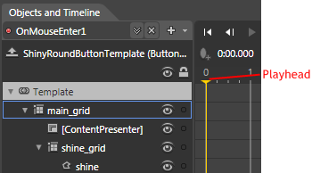
The ‘Objects and Timeline’ panel switches to display the new Storyboard, which is given the default name ‘OnMouseEnter1’.
Drag the yellow playhead to 0.5 seconds.
Select the ellipse named ‘lightener’ and set its Opacity to 20%.
Select the ellipse named ‘outer_glow’ and set its Opacity to 100%.
Add the MouseLeave animation
On the Triggers panel and click the ‘+Event’ button to add another EventTrigger. Use the drop-down box to select the MouseLeave event.
Click the ‘Add new action’ button for the new event. Blend will automatically add an action to run the previous Storyboard, ‘OnMouseEnter1’.
Click the drop-down list and select ‘New Storyboard’. The ‘Create Storyboard Resource’ dialog is displayed with the Storyboard’s default name set to ‘OnMouseLeave1’. Click the OK button to accept and close the dialog.
The ‘Objects and Timeline’ panel switches to display the new Storyboard.
Drag the playhead to 0.5 seconds.
Select the ellipse named ‘lightener’. On the Properties panel, click the ‘Advanced property options’ button next to the Opacity property. Select ‘Record Current Value’.
Do the same for the ellipse named ‘outer_glow’.
Extract the Template
The template is now complete!
The final step is to move the template into a separate XAML file.
Select the resources tab and click the ‘Create new resource dictionary’ button.
The ‘New Item’ dialog is displayed. Name the new file ‘ShinyRoundButton.xaml’ and click the OK button.
Click the triangle to the left of the Window element and ‘ShinyRoundButtonTemplate’ should be displayed.
Click on‘ShinyRoundButtonTemplate’ and drag it onto ‘ShinyRoundButton.xaml’ to move the template into the resource dictionary.
Run the project
That’s it!
Hit the F5 button to run your WPF project and observe how the button responds to mouse-over’s and clicks.


No comments:
Post a Comment